Radio List
The radio list element has been given more customisable options to give users the ability to show the radio list in several different ways.
In this article we’ll be showing you the different options added to the radio list element.
Radio List Element
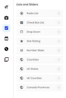
Radio list element can be found in the right hand side Toolbox in the form builder under the List/Sliders tab.
Once the element has been dragged on the form, the new options will appear on the right hand side of the page.
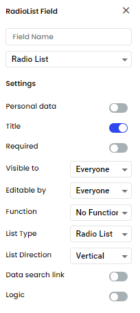
Radio List
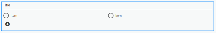
This option is the default and the original option for a radio list element. It gives users the choose of only one answer from several possibilities.
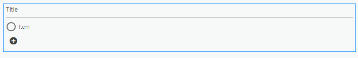
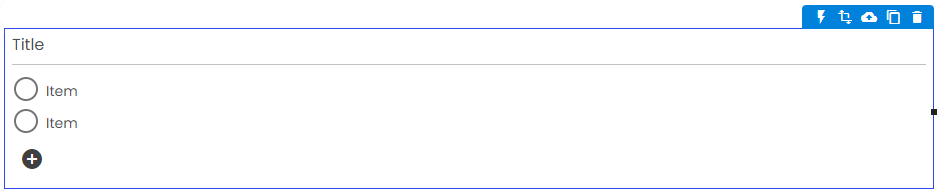
To add an option, click on the plus button in the bottom left corner of the element.
To remove an option, hover over the option and an ‘X’ will appear on the right hand side of the option. Click on the ‘X’ to remove the option from the element.
Buttons
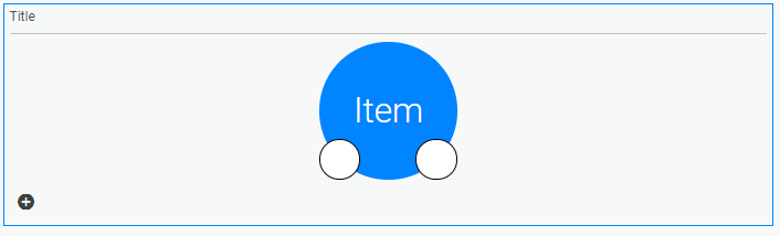
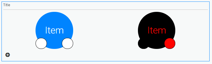
This option allows you to add buttons for users to give their answer. When you select ‘Buttons’ in the option list in the top toolbar you will see the first button on the element.
You have the options to change the text in the button by clicking on the button.
You also have the option to change the colour of the button by clicking the left hand circle and change the colour of the text in the button by clicking the right hand circle.
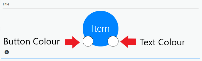
Each button can have it own colour for the button and text.
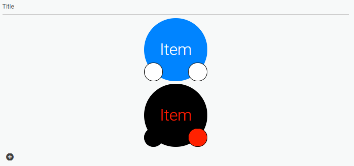
To add a button, click on the plus button in the bottom left corner of the element.
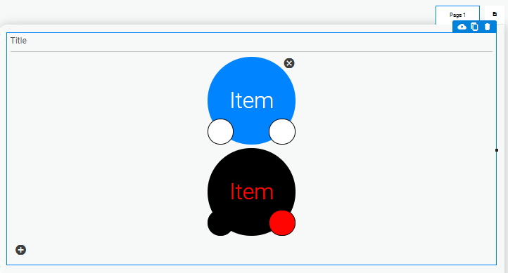
To remove a button, hover over the button and an ‘X’ will appear in the top right hand side of the button. Click on the ‘X’ to remove the button from the element.
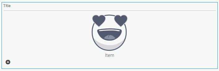
Images
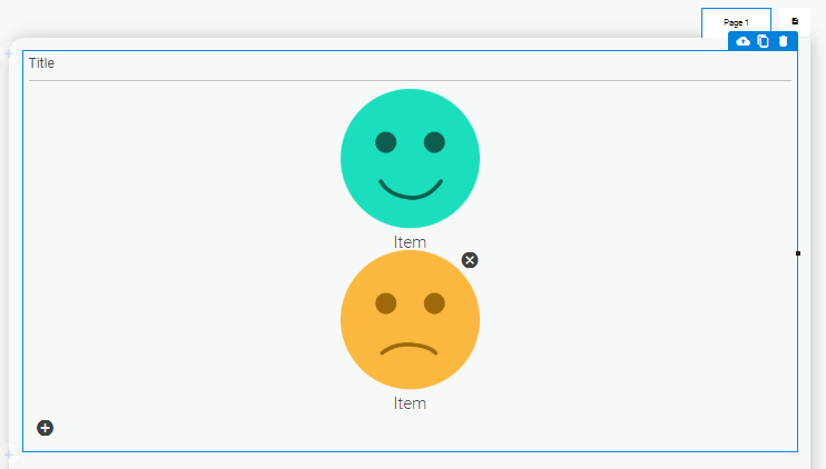
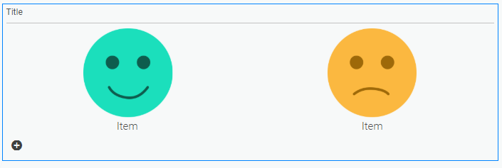
This option allows you to add faces for users to give their answer. When you select ‘Images’ in the option list in the top toolbar you’ll see the first face on the element.
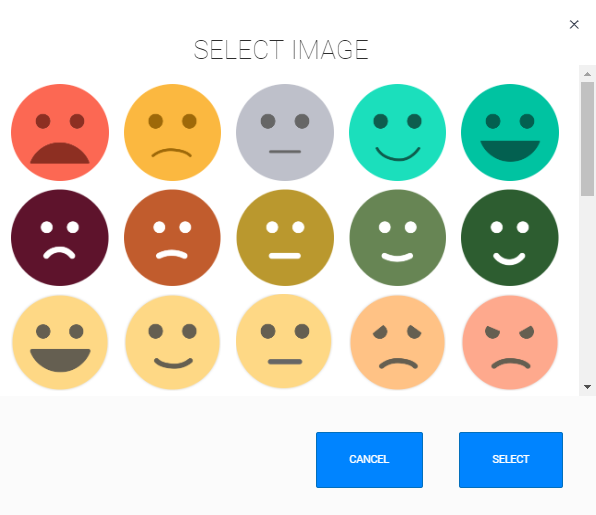
You have the options to change the image displayed by clicking on the first image. Once you click on the image, a menu will pop up with all the choices of faces.
You can also change the text displayed with faces by clicking on ‘Item’ and replacing it whatever you chose.
To add an image, click on the plus button in the bottom left corner of the element.
To remove an image, hover over the image and an ‘X’ will appear in the top right hand side of the button. Click on the ‘X’ to remove the image from the element.
Vertical or Horizontal
Radio list, Buttons and images now have the option to be displayed vertically or horizontally. To achieve this, click on the radio list element. Once the radio list is highlighted, click on vertical in the top toolbar.
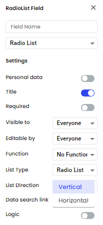
This will give you the option to display the radio list element either ‘Vertical’ or ‘Horizonal’.
Radio List Horizontally
Buttons Horizontally
Images Horizontally
Related Articles
Toolbox Options
The form builder’s toolbox contains all the various data field types a Array form can hold. The form builder’s toolbox contains all the various data field types a Array form can hold. In this article, we provide a brief explanation of the various ...Buttons
How to use buttons in Array At the top of 'Lists & Sliders' the first option you will come across is 'Buttons'. You can drag and drop this option onto your page and five examples of further buttons will appear. You can also add and remove very ...Functions
Functions is a great addition which allows you to add text, formula or value functions into your Array forms. Functions is a great addition which allows you to add text, formula or value functions into your Array elements allowing user to populate ...Form Builder
Here is where you design and edit your forms. The form builder is where you can design and edit your forms in Array. The form builder also contains all the information for that specific form such as any submissions and all the sharing option. In this ...Form Settings
How to use the wider range of functions that can be found in the settings cog of your form. This section details how to use the wider range of functions that can be found in the settings cog of your form. These settings are designed to enable you to ...